Wow! Serpentina! A unique gem in a sea of neutrals. We've literally been suffocated with every type of neutral color there is. Not just once either. This neutral obsession has been going on for years now.

Now I love a good neutral palette as much as the next gal. My everyday palettes are in fact Urban Decay Naked palette original (1) and 3. I don't own naked 2 because to me again its just different types of the same. When the naked 3 came out I was excited. At least it was more pink neutrals than brown, but I will do a review on that later.
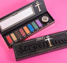
Alas, we are here for the beautiful Serpentina! A palette inspired by ancient Egypt. I was in the market for a palette and after perusing the online shelves of Sephora, Ulta and KVD's very own website I chose this after much contemplation.


Now im guessing I have some of the same questions a lot of you considering this palette do. For $46 USD this isn't a cheap purchase to be made lightly for the majority of us. It is cheaper than the naked palettes, and most other palettes for that matter but still expensive. Whether you're a fan of KVD makeup or just stumbled across this because of the beauty, the colors and the hype, you know this is a beautiful choice. But are the colors wearable. Can the majority and the average of us pull off these colors on any day but Halloween or any night but club night?

I looked up tutorials and while there were some there weren't many that were actually wearable on a daily basis. Well lucky you! I have found a few ways to make this palette wearable!

You can go all out easy with this guy but the real talent is getting some real wear out of these colors. Granted no matter how muted the looks you will stand out. If you're a neutral kind of girl you probably won't feel comfortable but for the rest of us who want to stand out, be a bit different, set the trends instead of following them, being the black sheep in a group of white sheep, being at the front of every trend set instead of following the group of everybody's this palette is for you. This palette is different and speaks to a special kind of woman but I know this woman will love this palette.

So let's get to the unboxing.
This palette comes in a thin cardboard like box that opens on both ends. The box has a satiny finish with shiny black lettering for the title on the front and gold lettering for the cross that is the T in the title name and every other bit of lettering on the box.

On the sides of the box theres an ingredients list on the front and some lettering on the back side


Then on the back there is gold rectangles mimicking the shapes of the eyeshadow pans with the names of the eyeshadows. Along with some other wording. There's a code on the side of the box with the barcode. My code is as pictured but thats usually a very easy way to pick a fake out. Contact kvd or sephora find out the couple codes used and make sure the barcode and lettering and feeling of the box all match before you make an online purchase from a dealer that's not a reputable store. You'd be surprised how many people are duped daily. You're more likely to purchase fake make up before you get the real deal all in the name of saving a few bucks. If they can't prove where they purchased it since everyone can get their purchasing history via credit card or email from where they bought it then do your research. If you still can't prove it's real do yourself a favor and move on. Fake purses, makeup, etc. Aren't just sold out of the back of trunks in a seedy part of the city any more. This is a prevalent problem people like you and I fall for daily. It's even happened to me and I always look up how to tell a real from a fake before purchase. For example google "how to tell a real anastasia highlighting palette from a fake" tons of blogs pop up and when you read one you will see that every single one of them being sold on poshmark and mercari are fake. Very disappointing. So heres the barcode and code.


Anyway that's it. Thats the box. Fun right?
Now let's open it up babes! Drumroll puhleez! ..... Thank you! Thank you very much! Here's the first opening pic!

I turn the box upside down with the open end on the bottom, hold it by the sides in the middle and shake the package ever so slightly so it slowly slides out. I catch it immediately and lightly pull it the rest of the way. Duh duh duh dun! This is it girls!

Beautiful! Similar to the outside packaging except for the beautiful gold design surrounding the sides that Ms. Kat designed on her very own! Actually this talented lady designed all the packaging both inside and out but I think this little design element was really beutiful and portrayed some of what she wanted this palette to portray.


 The colors are as searched below. Venom is a royal worthy muted true purple. Scarab is just what you would think of if you were to equate a color with the a serpentina (name of the palette not the color.) a glitter green. It actually looks a bit deeper in the pan in natural light as opposed to how the picture above where flash was used made it look. Next up we have Nile. A beautiful ocean blue shimmer shadow. When I imagine the Nile river this would be the color I would dream of. Next is hieroglyph. Hieroglyph is one of my favorites. If you have deep colored eyes, usually blue, oranges tend to make your eye color pop like no other. I know every time I wear any orange it makes my eyes the deepest blue-est blue. So this color was one of the selling points for me and I was not disappointed. More on the actual color payoff and use a little lower. Next up we have a sexy deep maroon/ brown/ red? Not quite sure how to describe this color but it is sexy. It's a shimmer color named Queen. I could definitely see a queen of ancient Egypt having jewels and beautiful clothes made of this very color to accentuate her tan skin and dark hair. Next we have a brown glitter shadow named Ankh. I believe that is pronounced o-nk. It is a unique color not ever seen in any neutral palette I've ever seen. This brown is somehow jewel toned, deep, passionate and sexy. Theres nothing "neutral" about Ankh. Next we have Medusa. Since we have profit (which will be introduced shortly, I would have preferred a different color and I will explain why shortly but honestly this dirty shimmer/glitter dark gold will get a lot of use. Last but certainly not leased of the panned and pressed colors is Blood Milk. The second and last matte shade in the whole bunch. It's a sexy, passion, fire, blood red. It is very hot.
Then randomly there is a good sized jar of true yellow/gold loose shimmer pigment named Prophet. I don't like how all loose pigments have a sticker over them that is ridiculously hard to get off because powder gets stuck to it but I guess it's better than no protection and a big mess. Although to be honest I can think of at least two ways to do this better for no more cost, but whatever. The color is beautiful and there is plenty of it.
Here are the swatches.

As you can see from the swatches all the colors have amazing pigment and payoff. There's hardly any kick up and I barely had to touch my brush to the pan to get enough and even if that wasn't the case you can always go back for more so you don't waste any and don't cause kickup. The first day I used Prophet and Medusa as a thick liner on top of Mary Kay eye primer. Then I added a thin line of liquid liner and mascara. I slept in it and wore it all day in the hot summer heat and it didn't fade, melt or budge. I was stunned. (No pics of this look yet sorry.) Then today I wore a transition color not included. It was a matte neutral light/medium brown. I did this just so my look would blend more seamlessly. I put this right above my crease. Then I grabbed some Ankh and brushed that in a small circular motion across the end corner and dragged it on top of my transition color above my crease with my blending brush. I use Sephora pro blending brush large 27. Then I added Hieroglyph all over the lid and over a little bit onto ankh just so there were no harsh lines. I used a flat shadow brush for this. Just a cheap target brush. No name or number sorry. Then I used my anastasia Beverly hills eyebrow brush for lining with medusa on my bottom lash line. I will put a picture of my brushes because the numbers and names have worn off some including this one but it is the thin, angled, liner brush. After this I used another Anastasia Beverly Hills eyebrow brush with a flat even brush for lining on top of my liquid eyeliner to set my liquid liner.

I used lash stiletto liquid eyeliner in their darkest black color and on top of that I used the black from my naked palette for liner.


Here's some pics but it was just a quick thing to play with them. They lasted hours and. Could have lasted longer but I washed them off. I used the same eye primer.it was five am. I know I looked horrid lol.
I could and will use these all as liners and more looks so stay tuned for more tutorials from this palette to come soon.
The only bad thing about this palette is that it doesn't come with a brush but honestly I have cheap and expensive brushes and they all work just about the same as long as they weren't actually a dollar. You can tell by running your finger across if they are cheap or not so even if you're a beginner don't go out and buy a bunch of expensive brushes you don't need. Im giving this 4 1/2 stars. I loved everything about this palette except that there's no brush. It sucks but would definitely not be a deal breaker.
Share your stories, opinions and comments and don't forget to subscribe for more.
Xoxo
BETH
Now let's open it up babes! Drumroll puhleez! ..... Thank you! Thank you very much! Here's the first opening pic!

I turn the box upside down with the open end on the bottom, hold it by the sides in the middle and shake the package ever so slightly so it slowly slides out. I catch it immediately and lightly pull it the rest of the way. Duh duh duh dun! This is it girls!

Beautiful! Similar to the outside packaging except for the beautiful gold design surrounding the sides that Ms. Kat designed on her very own! Actually this talented lady designed all the packaging both inside and out but I think this little design element was really beutiful and portrayed some of what she wanted this palette to portray.


It's got a good weight to it at first hold. A bit heavier than naked 3. It's got a silky feeling to the box. It has a magnetic strip that keeps it closed or snaps it shut. It's got a great box and it doesn't open at the drop of a dime so I personally could travel with this unlike the original naked palette.
Now let's get to what I'm sure you actually care about.
THE REVIEW:
at first glance the colors are just as beautiful as pictured online. It isn't all that way since these companies pay a lot for professional photographers, lighting, airbrushing, photoshopping, etc. But no, it's exactly as pictured. Here is my actual palette. (Actual all these pics of the pallette are mine except for the stock photo at the very top.)

Then randomly there is a good sized jar of true yellow/gold loose shimmer pigment named Prophet. I don't like how all loose pigments have a sticker over them that is ridiculously hard to get off because powder gets stuck to it but I guess it's better than no protection and a big mess. Although to be honest I can think of at least two ways to do this better for no more cost, but whatever. The color is beautiful and there is plenty of it.
Here are the swatches.
As you can see from the swatches all the colors have amazing pigment and payoff. There's hardly any kick up and I barely had to touch my brush to the pan to get enough and even if that wasn't the case you can always go back for more so you don't waste any and don't cause kickup. The first day I used Prophet and Medusa as a thick liner on top of Mary Kay eye primer. Then I added a thin line of liquid liner and mascara. I slept in it and wore it all day in the hot summer heat and it didn't fade, melt or budge. I was stunned. (No pics of this look yet sorry.) Then today I wore a transition color not included. It was a matte neutral light/medium brown. I did this just so my look would blend more seamlessly. I put this right above my crease. Then I grabbed some Ankh and brushed that in a small circular motion across the end corner and dragged it on top of my transition color above my crease with my blending brush. I use Sephora pro blending brush large 27. Then I added Hieroglyph all over the lid and over a little bit onto ankh just so there were no harsh lines. I used a flat shadow brush for this. Just a cheap target brush. No name or number sorry. Then I used my anastasia Beverly hills eyebrow brush for lining with medusa on my bottom lash line. I will put a picture of my brushes because the numbers and names have worn off some including this one but it is the thin, angled, liner brush. After this I used another Anastasia Beverly Hills eyebrow brush with a flat even brush for lining on top of my liquid eyeliner to set my liquid liner.

I used lash stiletto liquid eyeliner in their darkest black color and on top of that I used the black from my naked palette for liner.


Here's some pics but it was just a quick thing to play with them. They lasted hours and. Could have lasted longer but I washed them off. I used the same eye primer.it was five am. I know I looked horrid lol.
I could and will use these all as liners and more looks so stay tuned for more tutorials from this palette to come soon.
The only bad thing about this palette is that it doesn't come with a brush but honestly I have cheap and expensive brushes and they all work just about the same as long as they weren't actually a dollar. You can tell by running your finger across if they are cheap or not so even if you're a beginner don't go out and buy a bunch of expensive brushes you don't need. Im giving this 4 1/2 stars. I loved everything about this palette except that there's no brush. It sucks but would definitely not be a deal breaker.
Share your stories, opinions and comments and don't forget to subscribe for more.
Xoxo
BETH
No comments:
Post a Comment